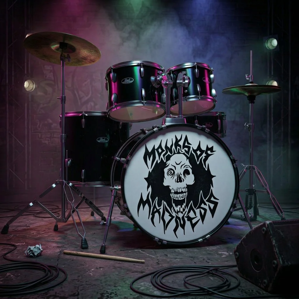
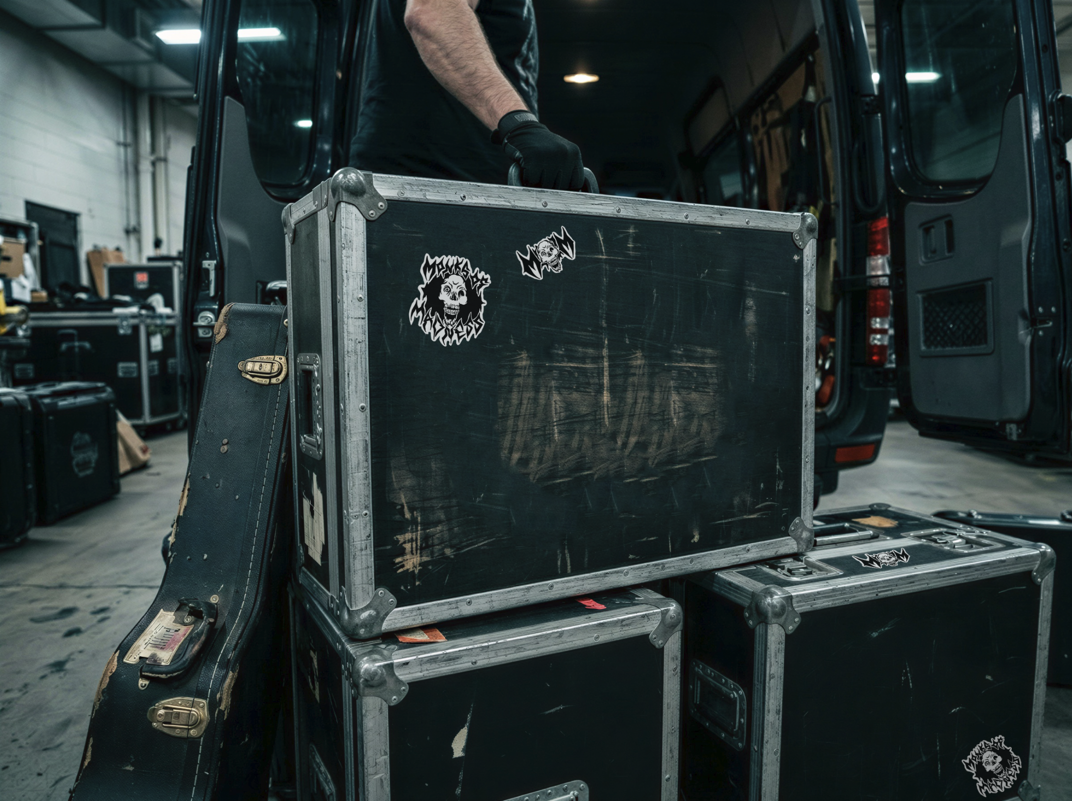
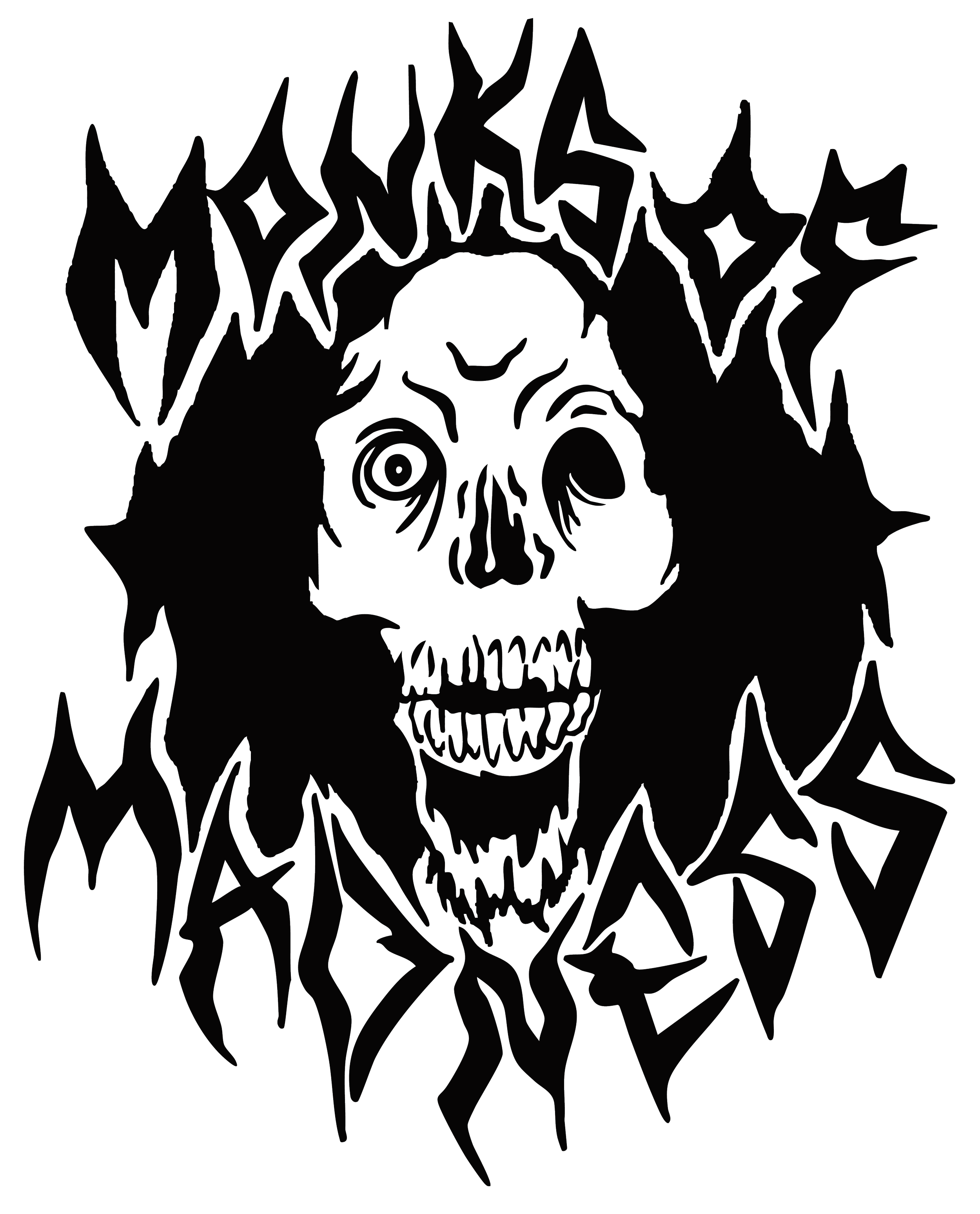
Monks of madness
Monks of Madness needed a visual identity that captures the raw intensity of their Corpus Christi screamo sound while nodding to classic metal aesthetics. The new logo fuses hand‑drawn, distressed typography with a graphic of a decaying monk corpse, instantly communicating the band’s bleak, chaotic energy.
-
Monks of Madness is a local screamo group from Corpus Christi, Texas, known for ferocious vocals, relentless riffs, and a dark, theatrical stage presence that blends religious imagery with visceral aggression.
-
Create a band logo that adheres to traditional metal/screamo typographic conventions, sharp, jagged lettering rendered by hand, and pair it with an illustrative element of a decomposing monk corpse. The design must be instantly recognizable, work across merch, album art, and digital platforms, and reinforce the group’s themes of madness, decay, and defiance.
-
We began by sketching a hand‑drawn typeface that mimics the uneven, splintered strokes of classic metal logos, then refined the letterforms for legibility at both large and small scales. The decaying monk corpse was hand illustrated to emphasize rot and corruption. The two elements were merged so that the logo can be reproduced in monochrome or limited‑color palettes for merch, posters, and online branding.


DELIVERABLES
black & white logo system
PRIMARY LOGO | WHITE
PRIMARY LOGO | BLACK
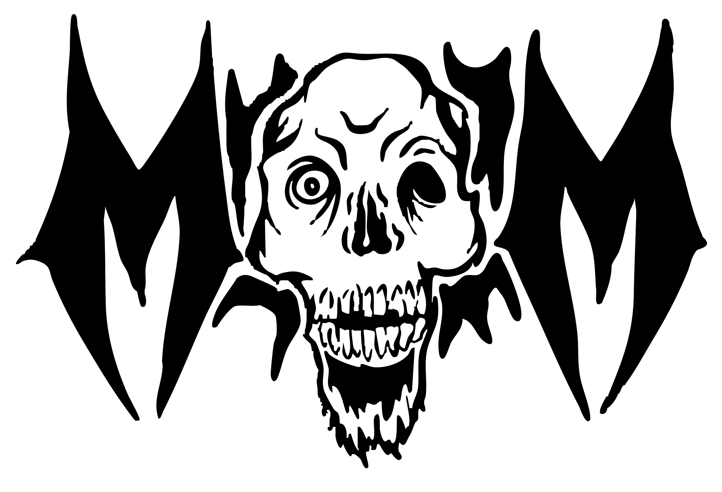
ALTERNATE LOGO | BLACK
ALTERNATE LOGO | WHITE